NH Department of Revenue Administration Website Redesign

The Problem
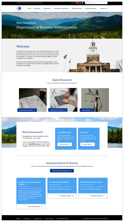
Navigating the website was a challenge for returning and new users. Tax resources feel naturally overwhelming to navigate, and it was especially difficult for visitors to find their needed documentation as the site lacked a clear path for users to follow. Its dated design also made the website appear dated and not well maintained.The Solution
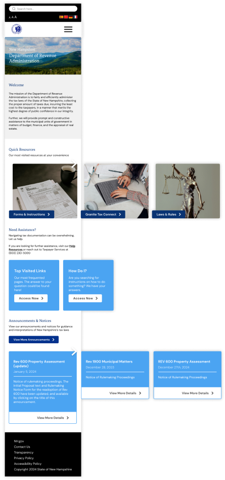
Consolidating and updating the structure of primary and secondary pages on the website’s multiple main navs would play a key role in establishing a seamless user navigational experience. In addition, updating the UI design would modernize the government organization’s look & feel and incite trust in the users..png)
Project Objectives
- Achieve a seamless navigation experience for website visitors
- Eliminate redundancy in information architecture
- Optimize UI through coherent and purposeful design
- Modernize look & feel through an updated Style Guide
.png)
My Role
- UX Researcher
- UI Designer
.png)
My Tools
I used the following tools to assist me in the research and development of this project:
- Figma
- Figjam
Heuristic Evaluation and User Interviews
Performing a Heuristic Evaluation and user interviews allowed me to identify the key areas of focus for the website redesign.
All interviewees agreed the website:
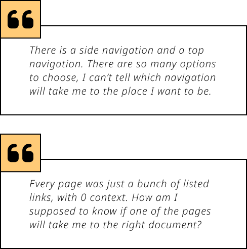
- Felt dated. It was hard to trust the information provided when the website does not appear to be maintained often
- Was difficult to navigate. There are multiple navigations, but this was more confusing than helpful. So many links and pages you can click, but all of them gave users the same level of uncertainty (“will this take me where I need to go?”)
- Lacked clear direction. Most pages simply contained links to other pages, but no instruction or guidance on how to access and/or submit tax documentation

Proto Persona: Ashley Ortega
About Ashley
Ashley is a 39-year-old, married, self-made business owner. She’s incredibly driven, organized, and likes to get straight to the point (she doesn’t have time for confusion!) She’s detailed-oriented and loves in-depth instructions and guidance. She works long hours, which is why she often takes weekend vacations and spends time with her family as much as she can.
Goals
- Needs guidance on which documentation to fill in to complete her business taxes
- She’s a busy person, so she wants to gather all info needed as fast as possible
Pain Points
- All tax resources are overwhelming, too much to navigate through
- Difficult to find guidance on which documentation she needs
User Flow & Navigation
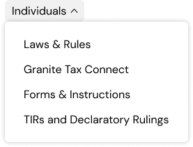
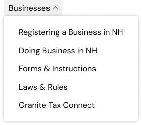
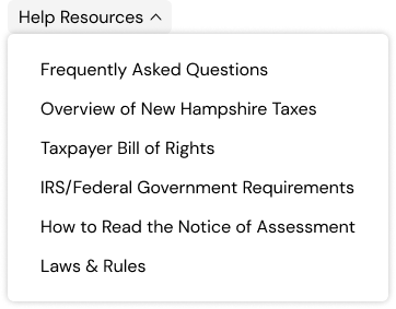
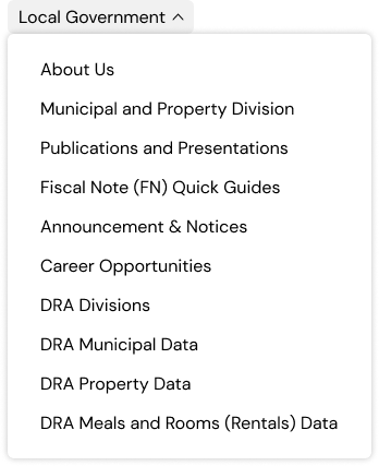
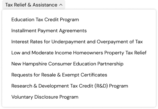
Through a card sorting exercise, I developed a new navigation that consolidated the original two with the goal of providing more clarity for the user

UI Style Guide
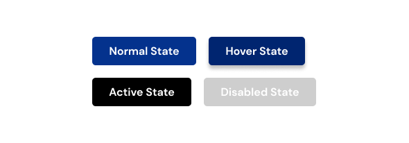
This updated style guide aimed to modernize the website by adding more splashes of color while still maintaining a feel of professionalism.
UI style adjectives include:
- Clean
- Professional
- Established
- Helpful


Final Designs
